What is it that makes a good public space? We know one when we see it but often find it hard to define why one place works and another one doesn’t. Arthur's Quay Park in Limerick is a sort of accidental public space; it was never planned and yet it exists, anchoring the north east corner of the Georgian grid of Limerick city, balanced by the People’s Park to the south west. The park was an incomplete Georgian Square, planned to be surrounded by houses but never finished due to the Great Famine (1845-52).

Hardly working
Arthur's Quay Park sits on a piece of reclaimed land, originally a harbour, and was filled in by Limerick Corporation in the 1970s to create a car park, before subsequently, in the late 1980s, being transformed from a car park to a civic space; completed with a tourist office as a focal point (the tourist office won the RIAI Gold medal in 1989-91). The park is greatly valued by the people of Limerick, however, there is also a deep sense of frustration as the space never seems to quite live up to its potential. Various interventions have taken place over the years, such as the removal of planted railings to address safety concerns and improve visibility, but it still feels as though it is an underperforming public space. And in recent years, with the boarding up of the tourist office, it lacks a sense of purpose. The park has one great asset in its favour though – the spectacular views up the river towards King John’s Castle and the mountains beyond. Notwithstanding this, it still feels disconnected from the city core and remains remote from most people’s mental map of Limerick city.
Working hard
Hamburg is also a city defined by its relationship with water. The advent of container shipping has meant that the main commercial port has moved further down river, leaving the historic port area available for transformation into a new city known as HafenCity. This area has been transformed over the last thirty years and one of the first decisions taken was to raise the new ground level of buildings to protect them from flooding. The landscape is arranged on three planes, ensuring that there is always a level that provides safe access during times of flooding, while for the rest of the time the landscape tiers down to the original harbour line, ensuring that the citizens of Hamburg are able to stay connected to the river that is at the heart of their city.

The quayside spaces in HafenCity are part of a continuous promenade with a variety of inviting public spaces, abundant greenery, and strong connections to the water. Some spaces change with the tides, while others are at a higher level providing a prospect over the river. There are also new water features integrated into the landscape providing a very immediate opportunity to engage directly with water.
It is not just the innovative landscape design that makes HafenCity such a success, it is the buildings that surround it, providing places for people to live, work, and play in the city. There is a very intimate relationship between the new buildings in HafenCity and the quayside. The space is overlooked by six- to eight-storey apartment and office buildings, the ground floors of which are generally active, containing retail and commercial uses. The traffic has been carefully planned to minimise the impact of the car, allowing connections between buildings and animated public spaces.
Lessons to be learned
While the scale of HafenCity is vast in comparison to Arthur's Quay, there are some key lessons that can be learned. Namely, that it is possible to plan for flooding without cutting a city off from its river, and that a quayside is a space of transition that should be thought of as part of a riverfront promenade rather than an isolated space.
For Arthur's Quay to reach its potential as a space that supports the life of the city, it needs to be more connected and integrated into the wider urban landscape. This will mean transforming the surrounding car-dominated highway into a civilised pedestrian friendly street that can serve as a route for traffic that is accessing the city centre, instead of supporting through traffic that does nothing to contribute to the life and activity of the city. In addition, the surrounding buildings should be redeveloped or reimagined so that they engage with the park through vibrant ground floor uses – offering shops, restaurants, and cafes. Convivial spaces with terraces overlooking the river can serve a new population living, working, and playing on the floors above.
What are we waiting for, the quay is the key.


Working Hard / Hardly Working is supported by the Arts Council through the Arts Grant Funding Award 2024.
Cover Image: "Hamburg, Germany - Aug 2016." Matt Kieffer. Accessed February 4, 2023. https://www.flickr.com/photos/mattkieffer/albums/72157673738031776/.
Image 1: "Photostream." William Murphy. Accessed February 4, 2023. https://www.flickr.com/photos/infomatique/.
Image 2: "Hamburg, Germany - Aug 2016." Matt Kieffer. Accessed February 4, 2023. https://www.flickr.com/photos/mattkieffer/albums/72157673738031776/.
Image 3: Author's own.
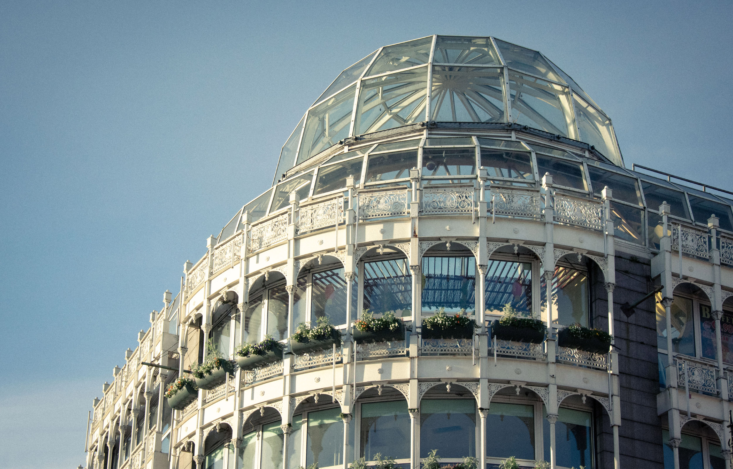
Walking up Grafton Street in the early morning hours one can catch Stephen’s Green Shopping Centre’s dome glistening in the sunlight, a historicist mirage standing out at the heart of Dublin city. At the top of the street, cornering with the park of the same name, the building stands as one of the latest instances of the city’s tug of war with heritage preservation.
The demolition and redevelopment proposal for the shopping centre submitted for planning permission in January 2023 prompted a group of young people with an interest in architecture and preservation to start the 'Save Stephen's Green' campaign, with the aim of raising awareness and advocating against the demolition through social media activism and an on-site protest. The redesign and the public backing of the campaign have brought the building to people’s attention, posing questions about conservation: what is historic, what is worth keeping, and what are we willing to let go of in the name of progress and development?
Built in the late 1980s, Stephen’s Green Shopping Centre stands on a site previously occupied by the Gaiety Green, a row of Georgian houses with small shop units rented out to vendors and known as the Dandelion Market at weekends. The site was put up for sale in 1980, and closed the following year, leading to the demolition of most of the original buildings. After several changes in ownership, construction of the shopping centre began in 1986, opening to the public two years later, in October 1988. [1]
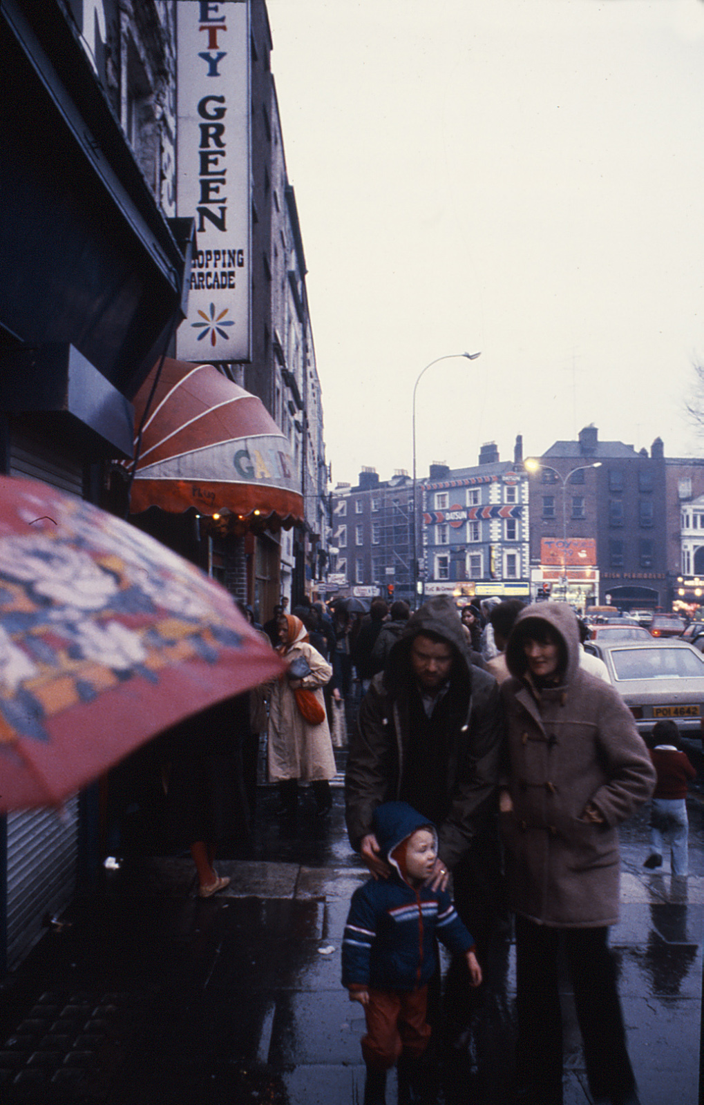
The development came at a particularly relevant moment in the city’s history, marking the Dublin Millennium, an event that attempted to raise questions about its urban development through a series of projects such as the repaving of nearby Grafton Street, or the competition for a new monument for O’Connell Street, Dublin made a striking effort towards a change of attitude that modernised its image and public space. This milestone coincided with an urban renewal and social rehabilitation movement taking place all across Europe, and aimed to bring the city closer to other international capitals, while improving its citizen’s life quality through an array of polished and pleasant outdoor and indoor spaces. [2]
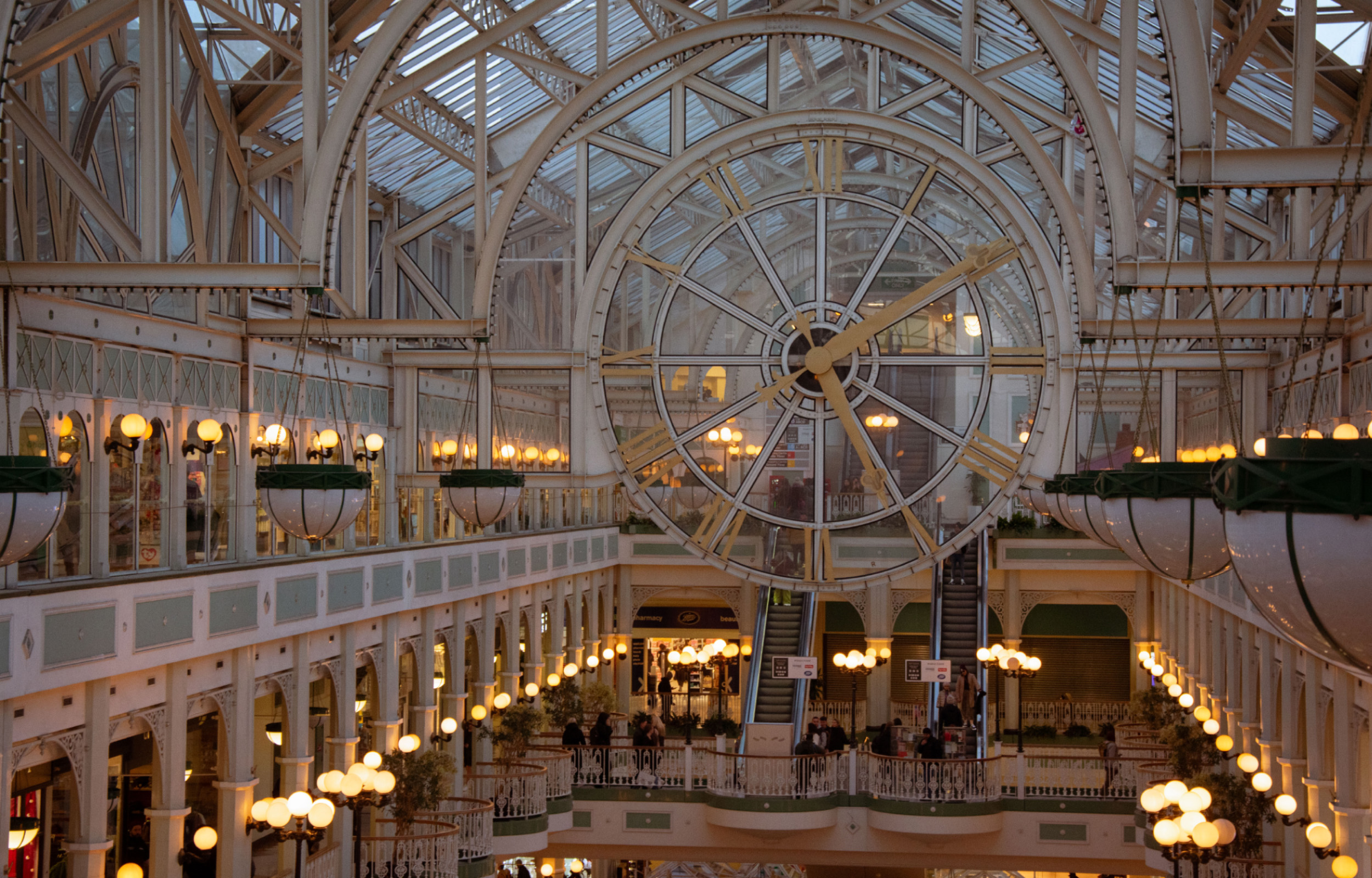
Stephen’s Green Shopping Centre, at the time of its opening, was no stranger to this context. In its design, architect James Toomey attempted to borrow some of these principles to conceive a commercial space that would recreate the feel and dynamics of an indoor street. With its winding circulation and glass-covered atrium featuring the renowned clock, the interior of the shopping centre resembled that of a 19th century train station or London’s Crystal Palace. The use of steel ornamentation continued throughout the building and onto the New Orleans style facade.
As is common for buildings of this style, its historicist postmodernism has been used against it by speculative developers, justifying its demolition under arguments disregarding its architectural value, measuring it purely on a matter of taste. This dialectic should come as no surprise, for the debate around the value of the “ugly and ordinary” as perceived by the architectural community, has been ongoing throughout the majority of the 20th century, and continues to be a conflictive topic. Even at the time of publication of Venturi and Scott Brown’s Learning from Las Vegas, now regarded as one of the key readings of postmodernism, their argument for studying what was then considered irrelevant or tasteless (“commercial vernacular” architecture) was strongly criticised or even dismissed by the architectural community. [3] We may therefore rescue some of their arguments to, at the very least, consider the architectural value of the shopping centre beyond arguments based merely on taste.
Half a century later, the economic forces at play are pushing for a shift in style, entirely conditioned by the profitability of the design, and made palatable to the public under the guise of architectural prestige. The simplification that took over the buildings analysed by Robert Venturi and Denise Scott Brown is common to developments at a global scale, seeking for neutral spaces that can be easily adapted at a lower cost, and blending the image of our cities into a homogenous global aesthetic in the process. The inevitability of this trend we appear to be passengers to, however, is confronted by an attitude from the public that refuses to step back and watch as it takes place. As we have seen by the engagement and involvement Dublin's citizens have taken in the Save Stephen’s Green Campaign, there is a sense of responsibility to participate in the city-making process, to make our voices heard in order to preserve and enhance the parts of our cities we find value in.
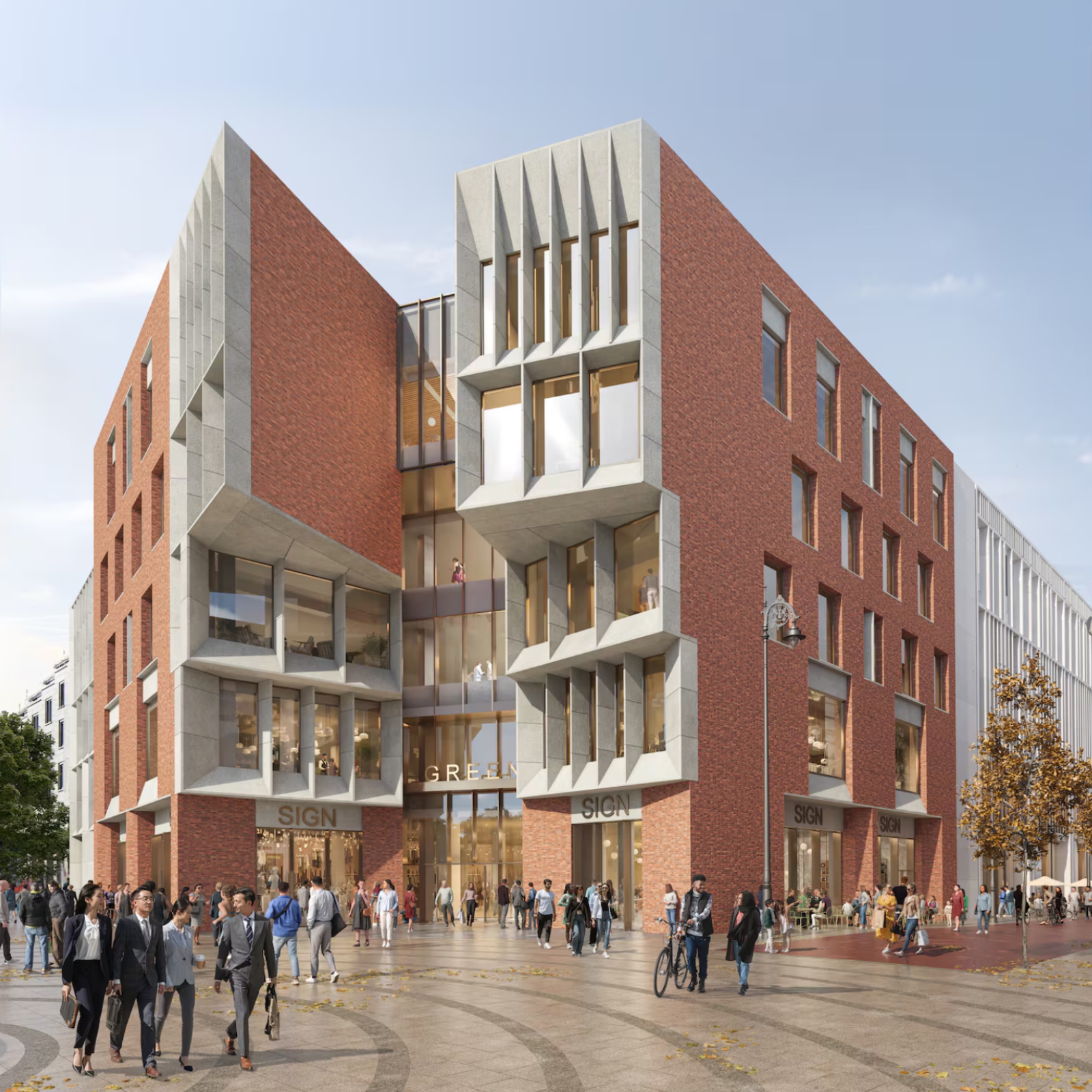
The statement that Stephen’s Green Shopping Centre is not old enough to be classed as heritage is not particular to this building, as it is a path we are going down with other 20th century buildings, prompting a dilemma to be considered by planners and developers: what constitutes heritage? The limits of what can be considered historic or worthy of preservation and protection are not based solely on a matter of age, as the Heritage Council states in its objection to the redevelopment plan, citing the shopping centre as “an iconic 20th century building of architectural interest and as a landmark building”. [4] Accordingly, other factors such as character, significance, and as pointed out by the Council, “architectural interest”, are at play in the issue of heritage.
What is or not historic does not depend exclusively on the year of construction, a conception of ‘old’ that can and will always become so as enough time passes, and we should not lose sight of the fact that not every building has the potential to become heritage. What is potentially historic is a question concerning the previously stated factors, first and foremost the relationship that us as citizens establish with architectural landmarks of our cities.
Will these commercialised, optimised for profit buildings ever become historic? In our campaign for the preservation of Stephen’s Green Shopping Centre, it became apparent that it was precisely the least profitable aspects of the building that people were most attached to. The atrium - arguably a profitless waste of space; the feel of an indoor space with its winding and oftentimes confusing circulations. Each served a purpose that went beyond the purely commercial as they allowed visitors to establish a connection with the shopping centre. By enabling us to regard the building as a landmark and a part of our identity, the creation of experiences and memories in a space that pushed the limits of the strictly mercantile inspired a movement to save it from demolition.
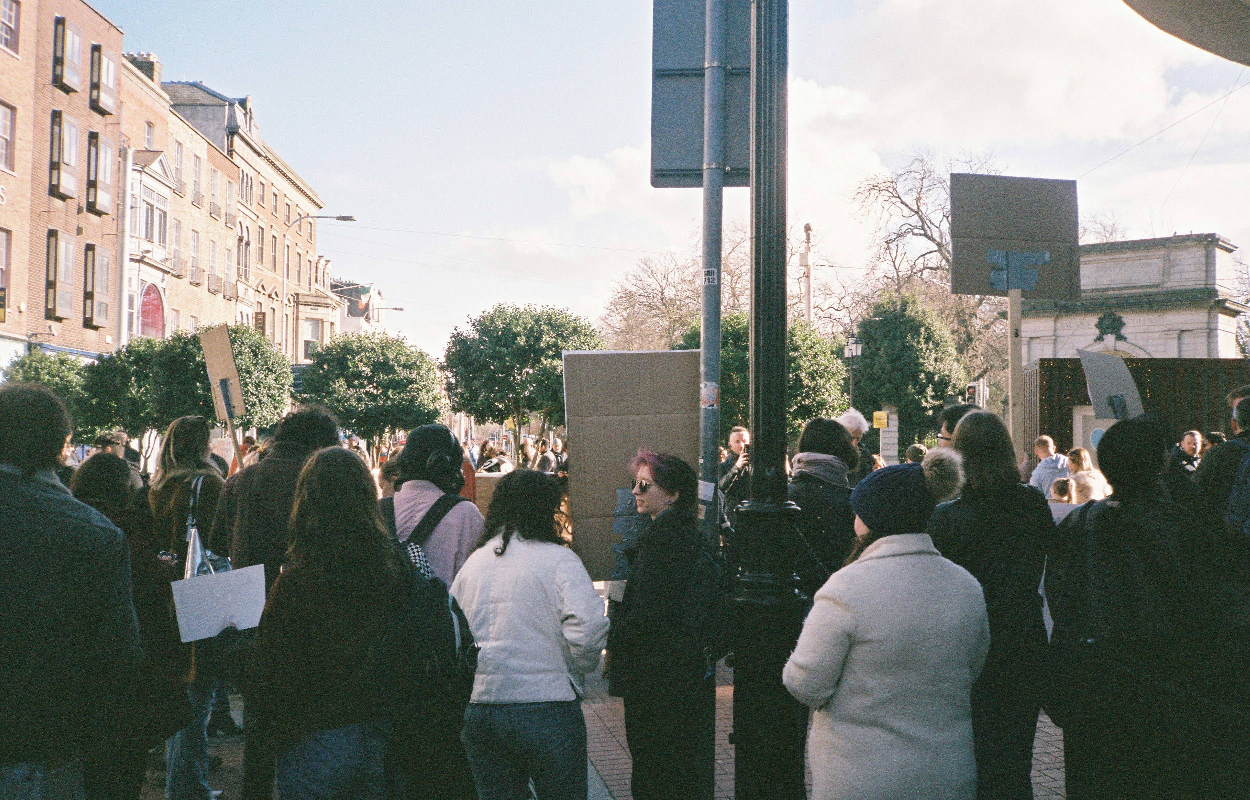
The reactions to the campaign were an excellent gauge of the public opinion, showing that while people are critical of the building’s flaws and its current state of decay, they care for it and want investment and effort to be put into renewing it, a proof that we collectively assign value to what we develop a relationship with.
We must, therefore, find a way to reconcile commercially viable and to some degree, standardised architecture, with the city’s character. While financial viability cannot be ignored, particularly in the current economic climate, failing to address this may result in a loss of the citizen’s sense of belonging, and a deterioration of our public and urban spaces.
In the current global situation, facing an overwhelming array of crises, both social and environmental, we cannot afford to settle for throwaway architecture. In an increasingly divided world, the processes taking place and shaping our cities demand us to take a step forward, paying close attention to them and assuming an active role in their making.
In this article, Marta Hervás Oroza examines how the redevelopment of Stephen's Green Shopping Centre has prompted a reassessment of what qualifies as heritage; as well as the role active participation plays in shaping our built environment.
Read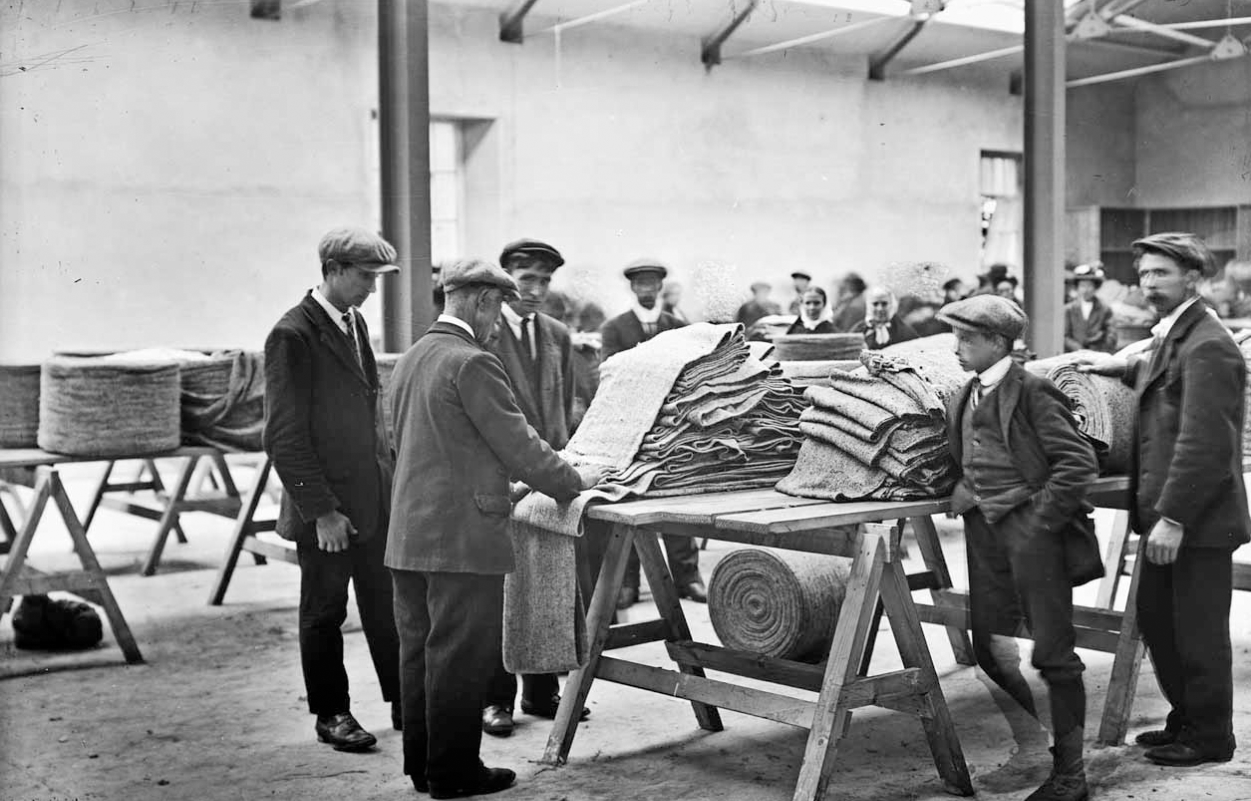
Nestled behind the Crocknamurrin Mountain Bog, beyond the sublime of the Glengesh Pass, lies the town of Ardara (Ard an Rátha), a rural village in southwest Donegal with a population of about 750 people. The context of southwest Donegal, like much of the West of Ireland, is characterised by a harsh environment shaped by the Atlantic coastline and its famed remoteness - factors that have long contributed to the allure and longevity of its most renowned export industry: Donegal Tweed.
In the spirit of the series, this article looks not towards whether a place is working hard or hardly working, but instead towards what we might glean from turning our attention to spaces of work themselves; what they might tell us about the story of a place, of how an emergent rural town found itself at the heart of a thriving cottage industry, and how that legacy continues to shape the fabric of this place today.
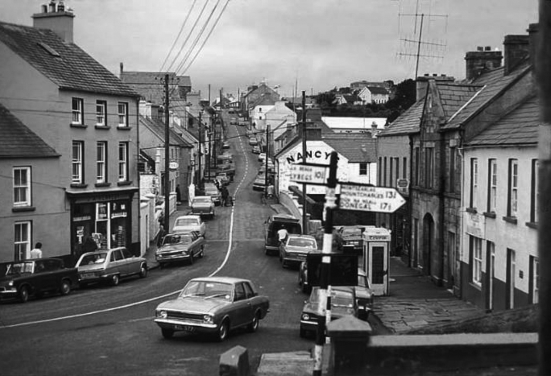
Anecdotal accounts refer to the sounds of working looms echoing through Ardara’s streets, where a trained ear could identify who exactly was weaving by the distinctive and unique clatter of their shuttle. A trade sustained by cottage industry into the 1970’s, looms were typically kept in working weaving sheds independent from the house – an early iteration of working from home before the concept of WFH as we have since come to know it. Separate from or to the rear of someone’s home, space for weaving has long been understood as a working shed more so than a studio space, or a place for artistic expression.
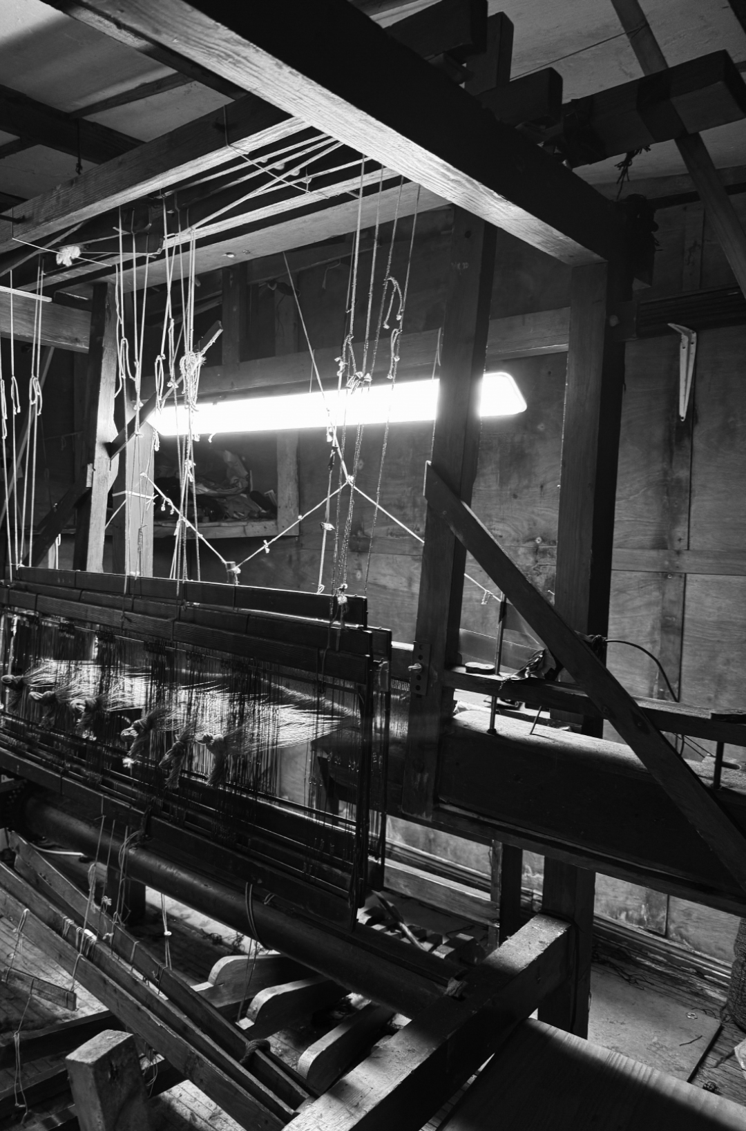
An informal environment, the weaving shed is carefully shaped by and for its user, with maximum practicality and ease of production in mind. What presents at first a disorderly chaos of timber sections, scrap yarns and curious tools reveals, on further interrogation, a perfectly planned and functional ecosystem. Level access is optimal for transferring heavy beams and yarns; garage doors to a laneway accommodate the proportions of double-width warp beams, and their loading in and out of trailers; 2.4m clear height allows vertical movement of the jacks, while 3.5m in width is required for swinging of the sley; a single LED light fixture plugged loosely into an extension cable illuminates the cloth beam for intricate on-loom mending, and so on. Beneath the tangible disarray of objects worn and used is something intangible – behaviours, habits and knowledge passed down through generations, linking this intimate, private space and its geographical location on earth inherently and forever to the identity of a craft. Workshop spaces like these belie the story and success of a place in ways both material and immaterial.
Geographically, the challenging conditions of mountainous bog terrain engendered a sense of isolation that contributed to the preservation of these traditional craft techniques. This terrain also provided the natural materials and resources required to produce and dye handwoven woollen textiles in times when communities were largely self-reliant, and living off the land.
In an economic context, Ardara’s textile industry has experienced periodic success punctuated by significant challenges. The Wool Act of 1699 implemented by the British Parliament prohibited, during a time of great success in the European market, the export of Irish woollen goods beyond the UK, to protect the English wool trade from competition with growing, colonial markets.
Ardara’s textile industry was supported by initiatives implemented by the Congested Districts Board, established by Arthur James Balfour at the end of the 19th Century with the intention of “killing Home Rule with kindness”. It is said that a visit paid by him to Donegal, prior to his establishment of the Board, “first opened his eyes to the poverty and misery prevailing there and brought about a change of heart” [1]
The Congested Districts Board's initiatives were designed to support local production and provide employment to areas that historically had relied on agriculture and home-based crafts. For Ardara, this took the form of the introduction of stamping high-quality handwoven goods, and led to the construction of a Mart building in 1912, where weavers would traverse from all over the rural area with their homespun frieze for inspection, storage and sale to the global market. [2]
The Congested Districts Board was purportedly involved in the provision of an improved hand-loom for weaving, invented by Mr. W.J.D. Walker, the Board’s organiser and inspector for industries, who generously placed his invention at the disposal of the Board. These improved looms were then supplied to the local weavers on a loan installment system.
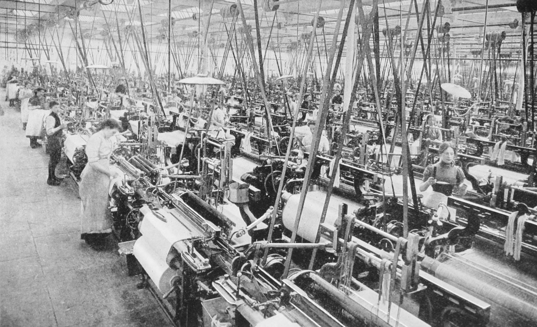
Although it was arguably established to consolidate British influence in the region, it cannot be denied that the Congested Districts Board aided in supporting this cottage industry at a time where it was in decline and uniquely, in establishing a network between towns in southwest Donegal; linked by the spinning factory in Kilcar, to a carpet factory in Killybegs, to Magee’s in Donegal Town, to the handweavers and Mart of Ardara and its surrounds. Whether intentionally or not, this network has enabled not only the craft to endure in harsh climates - meteorological and economical - but also, the make-up of these places, how they interact with one another, and what is literally woven into their urban and rural fabric.
Often when looking at public space or the development of towns and their successes, with an architectural lens we look to the physical - how trade, culture, or industry have physically shaped a place. In this instance, to begin to understand this place, it is necessary to observe how these same cultural influences have shaped a town in an immaterial, intangible, maybe even invisible way. The weaving shed as it has always existed, is a fragment of industry previous; a byproduct of its environment, natural resources and the resourcefulness of the people who inhabited it and sustained a craft.
In Teague’s pub you’ll find pillow cases handwoven by John Heena leaning against the snug at the front, and a beautiful shuttle placed above the door that once belonged to the owner’s grandfather. Ask anyone in the town and they will likely know something or have some connection to weaving, be it an old loom in their shed, or some lingering knowledge of how to construct parts of a loom. This almost inherent shared knowledge and understanding provides a mystical reminder of the vibrancy and prevalence of a once commonplace skill.
Across Ireland we have seen a surge in the value of craft, of people returning to making things from scratch, growing foods from the earth, using their hands to create, all in response - and sometimes protest - to the mass production, consumption and colossal waste that is draining our planet’s resources. Following the introduction of power looms in the 1970’s, the industry changed, making Donegal Tweed a legitimate and successful export worldwide which continues to thrive today. On a smaller scale, we find ourselves in a different cycle of weaving, where the focus lies on the craft of weaving as an artisanal trade, rather than a scalable business model.
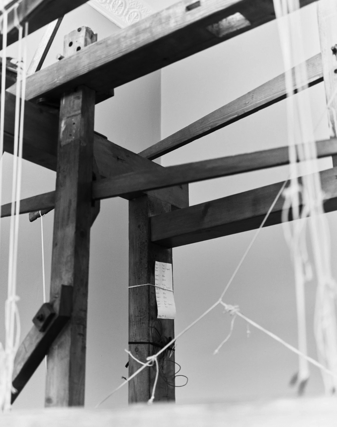
What was introduced earlier in this article as a humble, pragmatic workspace presents itself now as evidence of living heritage, a fragment of an industry past and an emblem of the future of handweaving in Ireland. It prompts a wider reflection on the revitalisation of Irish towns at large, examining their interconnectedness and the intangible forces that bind and sustain them. A holistic, ground-up approach is critical to any and all revitalisation efforts, rooted in the understanding of a place and responsive to the needs of its future; remaining ever mindful to see the story behind the shed.
Ailbhe Beatty explores the relationship between craft, culture, and heritage in Irish towns, examining how workshop spaces reveal the story of a place in ways material and immaterial.
Read
Scale in street-making is often a function of the objects or beings that a street serves, and a product of the time when it was designed and built. The medieval urban street would be narrow and tight if considered in the context of the width of a modern car - it was self-evidently designed for human-only occupation. Wide urban streets are a post-industrial phenomenon, but facilitating trade was not the only cause of expansion: for instance, the importance of the Dame Street-to-Dublin Castle route in 18th Century Dublin was emphasised by employing a wide-street design.1 Similarly, width was considered a vehicle for improving air quality and circulation, such as with Haussmann’s 19th century re-design of some of Paris’s most well-known avenues.2
The process of making new spaces, including urban streets, usually begins with a shopping list of needs and requirements which mix together to inform and produce a space of sufficient scale to balance a wide range of competing interests. Urban fabric generally thrives on the variety of scales and spaces produced by this process, which helps to ground the occupier in a sense of time and place. A number of Irish examples of wide streets, however, exist with a poor or at least muddled sense of human occupation.
Pearse Street is one such example. Originally named Great Brunswick Street, the street is a product of industrial expansion in the Dublin Docklands during the 18th century, and was renamed after Padraig Pearse in 1924. Its creation revitalised an area “hidden from the city by the bulk of T.C.D,” 3 and its width is an echo of the legal scale prescribed by the Wide Streets Commission in the Act of 1758, even though it was never an original target. It was, put simply, an urban trade route from the delivery point to final destination.

It is approximately 1.2 kilometers in length, spanning from Ringsend Road and the Grand Canal Bridge to the East, linking up with Tara Street and College Green to the West. At 19 metres wide, it is less than half that of O’Connell Street (49 metres). It consists of four lanes of one-way west-bound traffic flanked by two relatively narrow footpaths. It has few trees, central electricity poles or other vertical delineation, and mostly consists of low, slow-moving traffic and a high-level transversal Dart Bridge appearing at an angle from the upper storeys of the Naughton Institute of Trinity College. Walking it feels like hard work, with little to no changes in its surface materiality, landscaping or any other kind of visual variety to retain a wanderer’s interest along their way.
Much of the southern end constitutes the perimeter of Trinity College, with relatively little life at the street level, while the northern end is peppered with a number of vacant and closed off facades. It is telling that such a prominent street and transport node, with the benefit of south-facing facades, seemingly turns its back on the pedestrian. The root of the issue likely stems from an unpleasant and dangerous atmosphere created by the cacophony of traffic, but the removal of traffic in and of itself is not conducive to a successful street. It begs questions about what interventions can be done to reinvigorate this seemingly forgotten stretch?
Modern interventions to wide streets generally consist of two actions. Firstly, they can be subdivided with hardscaping and landscaping in an attempt to sequentially arrange the street occupation nicely for the human: if we move through a wide street like a series of mini streets and spaces, our interactions with the street will be easier; our understanding will be broken down and more easily digested.
O’Connell Street is one such example that has benefitted from spatial, visual and material compartmentalisation. The tarmac which is applied to the majority of the roadway is interrupted at the GPO, where a high-quality granite paving sett is used for both the road and footpath, emphasising the importance of that historic building and providing variety for the pedestrian. The width of the roadway is punctuated by a central pedestrian spine throughout, with all three pedestrian thoroughfares on the street organised around a variety of trees, old and young.
The success of such segregation would point toward a logic that streets designed for pedestrians should therefore be similarly organised. Such an approach, however, may diminish the original grandeur and scale of the street. It can prompt wayfinding issues by interfering with the visibility of landmarks that contribute to a sense of place inherent to a city’s fabric.4
The second option is generally to leave them to their original devices; the accommodation of vehicular movement. In an era where movement is dominated by the car, and the streets’ spaces are merely vehicular lanes, this makes for an element of the urban fabric, which is unfriendly and, frankly, unoccupiable.

“First we shape cities, then they shape us.” 5 Pearse Street was – finally - recently the subject of a Dublin City Council decision to restructure traffic routes, with the removal of cars approaching from Westland Row. This, hopefully, is the conclusion of the previous indifference it has suffered from - now that space for cars has been diminished, human-centred urban interventions, with a particular emphasis on variety in all aspects, should follow suit.
In this article, Laoise McGrath reflects on the challenges presented by wide streets, the prioritisation of cars over people, and the potential for more inclusive urban environments.
ReadWebsite by Good as Gold.